Some expert tips to make the most of small spaces
The design of a small building or apartment is often challenging but there are many tools that architect’s have at their disposal to find a solution that does not feel cramped or cluttered.
In this article I offer some tips on how to make the most of small spaces.
Keep it in proportion
In my opinion the most important thing is to make sure that all rooms and the objects that they contain are in proportion.
Circulation
If circulation areas (like stairways, halls, corridors) are kept to a minimum, you don’t waste space. Typically this means putting them in the middle of the plan.Or it may be appropriate for rooms to open off each other rather than off a corridor. A central hall if well located may serve all the other spaces dispensing with the need for corridors.
Optical illusions
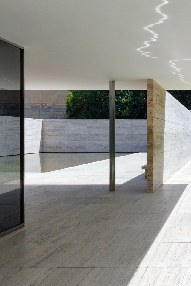
Vistas of adjacent spaces, internal or external, can give the illusion of a room being much larger than it really is. A common technique sometimes used to exaggerate this approach is to allow a wall or ceiling to extend from one space to another draws the eye into the next space making the room feel bigger. A simple example of this technique is to divide a room by using a screen that does not touch the ceiling or walls. Another is if an opening between to rooms occurs at the corner of the room and the wall is be seen to continue into the next room through the opening. These techniques are used with great skill in the Barcelona Pavilion by Mies Van Der Rohe, work of Luis Barragan, The Villa La Roche and the Villa Savoye by Le Corbusier, the Church on Mount Rokko by Tadoa Ando.

Barcelona Pavillion, Barcelona, Spain designed by Mies Van Der Rohe.
Image by Jean-Philippe Delberghe (via Unsplash).
If there is no opportunity to look onto another space then there are other techniques such as the use of large scale backlit photographs of a favourite view which if framed correctly can appear as opening onto e.g. the courtyard shown in the photograph. This is really a modern day take on the use of trompe d’oeil (optical illustion) which is another technique that can be considered but one that requires greater skill for it to work.
Bring in the light
Mirrors can be used to visually extend spaces and to introduce light to areas that may not otherwise receive any direct daylight. This is one of the oldest and simplest techniques and can be very effective. Care should be taken though to prevent people from walking into the mirror.
The correct use of light both natural and artificial will enhance any space. Light can be used to create shadows suggesting other spaces.
Bring the outdoors in (and vica versa)
Access to the outdoors, be it in the form of a terrace, balcony or courtyard.
The use of curves at the junction between two walls instead of a corner can lend a sense of fluidity to the space.
Storage
Clever use of storage and multi-purpose elements and their correct location is critical to the design of small spaces, eg. Seating that houses storage in its base. Shelves or pull out drawers under stairs. High level storage and how it can be easily accessed should not be forgotten. Well designed and adequate storage space will help prevent the build up of clutter which will make the space appear smaller.
Multi-purpose spaces
The design of spaces so that they can be used for different tasks can reduce the amount of rooms that a building needs to be divided up into. This can be very effective and is most typically evident the use of living-dining rooms in modern homes rather than a separate dining room that is only used a few times a year. Folding doors/sliding walls can be used to great effect, dividing rooms for separate purposes when required and then opening them up so that they create one big space if desired. When using this technique some consideration should be given to whether sound is going to be an issue when the room is divided into smaller areas, this will affect the choice of material used in the screen and the type of screen device chosen.
The use of folding glass doors between the kitchen and living spaces gives the option of hiding a messy kitchen if unexpected guests arrive, or of separating the living space from the noise of a washing machine. E.G. In the Mount St. Ann’s Milltown apartment scheme, by O’Mahony Pike Architects,.
The use of sliding walls in some apartments, to create flexible living/bedroom arrangements, by Urban Projects at Clarion Quay.
Open plan
Open plan design where individual rooms are avoided and kept to a minimum can be a great solution in a small space. One big space rather than lots of little rooms made smaller by corridors connecting them. The use of screens and location of furniture within the space can be used to divide the space into public and private zones.
The use of high ceilings and high-level glazing can lend a sense of grandeur in principal areas of a small building.


Architect B.Arch.MRIAI
RIAI Practice accredited in Conservation at Grade 3
More like this
Articles
Bright New House in Killiney A Rated
Killiney New HouseA beautiful, light-filled family home, BER A Rating. A modern 3 bedroom house inserted into a corner site set back from the road beside dormer bungalows. Designed around the garden, inside outside feel and great flow throughout. The original brief...

